
Coal-to-gas switch slashes U.S. power sector CO2

By William Nelson at Bloomberg NEF
Grid operators deploy generators in order of increasing short-run marginal cost. They use first the power that is generated at least cost and progress up a power supply curve called a ‘merit order’, adding generators to meet electricity demand at the lowest possible cost. This concept dictates how power plants operate hour-by-hour and underpins wholesale price formation in deregulated markets. In the U.S., power sector emissions have fallen 25% since 2008, in large part due to the way cheap natural gas has disrupted merit orders. Gas turbines now run more cheaply than plants burning coal, and therefore run more often.
The switch from high-carbon coal to lower-carbon natural gas is a fast-acting abatement opportunity available on many grids worldwide. Here we examine the mechanics behind coal-to-gas fuel-switching in the US and describes its impact on carbon dioxide emissions.
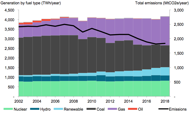
- Coal-fired generation dropped 40% from 2008-17, while coal capacity fell 13%. The decline is being propelled largely by lower utilization rates rather than plant closures: the average U.S. coal plant operated with a capacity factor of 49% in 2017, down from 67% in 2008.
- Cheap natural gas is the primary reason for coal’s decline. Every time a gas turbine fires up in place of a coal unit, overall emissions fall by an average of 0.6tCO2e/MWh. This is because gas is cleaner than coal and because gas turbines burn fuel more efficiently.
- Gas burn has expanded dramatically since 2008 – at the expense of coal burn, as the figure below shows. This fuel switch has done more to curb U.S. carbon emissions in the past decade than any other single factor, including new renewable build.
- Operational fuel switching, where one plant firing up in place of another, is entirely reversible. This is not the case with structural switches such as coal plant retirements or renewable installations. But structural switches take time to accumulate while operational switching can happen overnight.
Figure 1: U.S. power mix and power-sector emissions (Source: BloombergNEF, EIA Form 923)
Drivers of abatement from the U.S. power sector
The U.S. serves as a useful case study for understanding fuel-switch dynamics because of the extreme price-driven shift from coal to gas in recent years. It helps that U.S. power markets are relatively ‘pure’, in the sense that in practice, power fleet behaviour aligns closely with economic theory.
The figure below tracks greenhouse gas emissions from the U.S. power sector (black line) and estimates the reasons for year-on-year changes (stacked columns). Overall, since 2003, the leading source of GHG emissions reductions comes from ‘fossil fuel switching’, that is the replacing one form of fossil-fired generation with another – primarily coal to gas.
Figure 2: What drives U.S. power-sector emissions (MtCO2e/month; 12-month rolling averages). (Source: BloombergNEF, EIA Form 923)
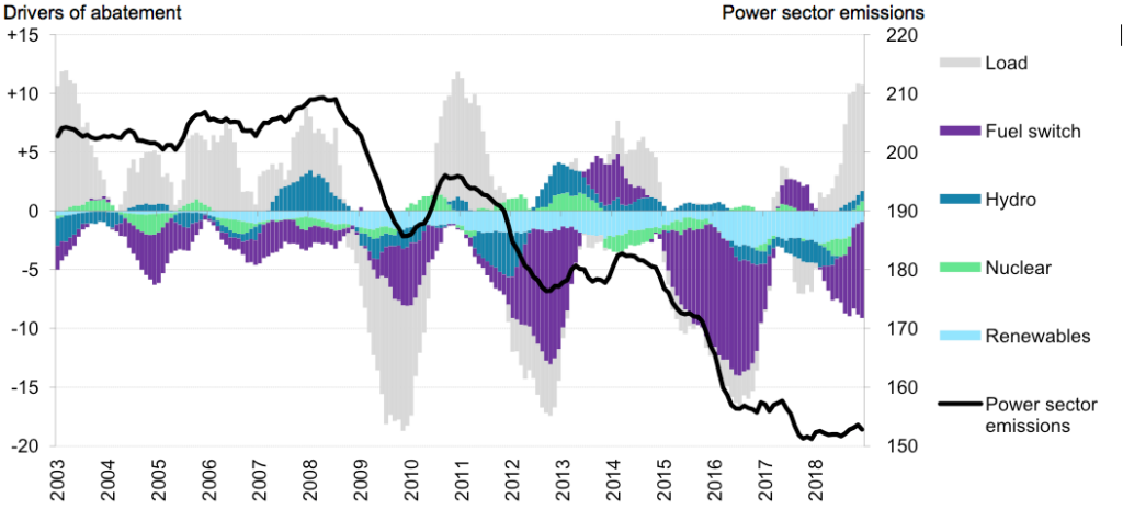
The drivers behind power-sector emissions fluctuations:
Overall, emissions dropped 25% from 2008-17, in response to the following drivers:
- Renewables: Steady year-on-year growth in renewable energy generation stifles fossil burn, making renewables the only ‘driver’ that consistently reduces annual emissions. All other ‘drivers’ are reversible, sometimes reducing, sometimes raising annual emissions.
- Hydro: Hydro is not a large part of the overall abatement story because hydro capacity has not changed much since the 1980s. Instead, annual fluctuations in precipitation cause high-hydro and low-hydro years – particularly in the Northwest – with knock-on effects for fossil burn.
- Nuclear: Like hydro, nuclear capacity has been mostly stable over the past two decades, though generation has oscillated slightly, due mostly to refueling schedules. Only a handful of new build and retirement decisions have altered annual emissions over the past two decades, though this is expected to change. Waves of retirements are expected; and this will render nuclear a ‘positive driver’ of U.S. power-sector emissions. Emissions will increase as reactors retire.
- Fossil fuel switch: The U.S. fossil fleet is getting cleaner. Fossil-fired emissions factors fell 19% from 2003-18, from 0.86tCO2e/MWh to 0.70tCO2e). There are several reasons for this:
- Coal-to-gas: Switching from coal- to gas-fired generation reduces emissions because gas is cleaner than coal and because gas turbines are typically more efficient than coal plants. The widespread coal-to-gas fuel switch that has unfolded on U.S. grids is foremost an ‘operational’ phenomena: gas units ramp up generation, neighboring coal units ramp down. This process is a function of the relative costs of gas and coal, and is entirely reversible. (Hence the sometimes-positive, sometimes-negative impact on U.S. emissions.)
Permanent fuel-switching can occur when coal plants retire or convert their kits to burn gas. But coal plant retirements have had a smaller impact on U.S. emissions reductions than utilization rates, and permanent retrofits are relatively rare. - Gas-to-gas: Gas-to-gas fuel switching occurs when one gas plant fires up instead of another. A growing fleet of efficient, combined-cycle gas turbines (CCGTs) is displacing generation from older, inefficient open-cycle gas turbines (OCGTs), reducing emissions in the process. Gas-fired emissions factors have fallen 15% since 2003 (0.47-0.41tCO2e/MWh).
- Coal-to-coal: U.S. grids have retired some of their least economic, least efficient coal plants in the past decade. When a coal plant retires, its output is immediately replaced with existing coal or gas.
- Coal-to-gas: Switching from coal- to gas-fired generation reduces emissions because gas is cleaner than coal and because gas turbines are typically more efficient than coal plants. The widespread coal-to-gas fuel switch that has unfolded on U.S. grids is foremost an ‘operational’ phenomena: gas units ramp up generation, neighboring coal units ramp down. This process is a function of the relative costs of gas and coal, and is entirely reversible. (Hence the sometimes-positive, sometimes-negative impact on U.S. emissions.)
- Load: Electricity demand influences emissions in an obvious way: higher load equates to higher emissions, all else being equal. Overall U.S. electricity demand has held flat since 2008 for a variety of reasons, including energy efficiency, saturation in the heating, ventilation, and air conditioning (HVAC) market, and the shift toward a service-oriented economy.
The story behind power-sector emissions fluctuations:
- 2003-08: Deregulation in the early 2000s encouraged a boom in new combined-cycle gas turbine development, and this led to a prolonged gas-to-gas fuel-switch (of newer plants replacing older ones) that helped keep emissions in check. (This is represented by the negative purple bars.)
But the economy was booming, and electricity demand grew more than 1% per year. Rising demand for electricity meant more fossil fuel combustion. Emissions peaked in 2008, which was also a dry year with low hydro output, just before the onset of the financial crisis. - 2009: Electricity demand plunged 4% in 2009, with the economy in the grips of the financial crisis. Emissions plummeted as load dropped, only to rebound the following year when the load reverted to ‘normal’ levels.
Something else was special about 2009, though: it coincided with the beginning of a period of parity between coal and gas prices. Pre-2009, coal was definitively cheaper than gas; since then, the two fuels have faced tight competition, frequently contributing to reductions in power-sector emissions (‘negative purple’). This is associated with the onset of the U.S. shale boom. - 2012, 2016: Emissions fell drastically in these two years because of deep coal-to-gas fuel switching. This process was amplified by atypically warm winters. For example, in a ‘normal year’, when the weather gets cold, the U.S. burns through its natural gas reserves to heat homes and businesses. But in 2012 and 2016, the U.S. gas industry emerged from wintertime with an excess of stored natural gas. This caused gas prices to collapse, gas turbines to fire up, and coal plants to ramp down.
- 2014: Emissions climbed in 2014 following an exceptionally cold winter. The so-called ‘Polar Vortex’ brought record-low temperatures in the winter of 2013-14. Gas storage levels were depleted; gas prices surged; the coal-to-gas fuel-switch reversed. Coal plants thrived.
- Regional differences: All grids are exposed to the drivers outlined above, but in different proportions. For example, the deepest emissions reductions of the past decade occurred in PJM and the Southeast, where renewable build was modest but coal-to-gas fuel-switching was particularly pronounced. Meanwhile, Texas and California absorbed the most wind and solar build, respectively, but power-sector emissions from these two states has remained relatively unchanged.
‘Merit-order’ mechanics
Merit orders are best interpreted with a basic understanding of the classic supply-versus-demand curve taught in Econ 101. ‘Merit orders’ are the name for the electricity supply curve created by a fleet of power plants. This concept unlocks an arsenal of insights that can be used to understand fuel-switching and power plant valuation.
- Every hour, grid operators take stock of their pool of generators and decide what to turn on and what to turn off. They try to meet electricity demand as cheaply and reliably as possible. Merit order diagrams help visualize so-called ‘optimal economic dispatch’ by ranking units in order of short-run marginal costs – that is, the variable costs of producing an incremental megawatt-hour of electricity, ignoring ‘sunk’ costs such as fixed operation and maintenance and capital expenditures for each generation unit.
- The most important factors governing short-run marginal costs for generators are fuel prices and plant efficiencies. For example, wind and solar farms do not burn fuel, so they generate cheaply and sit at the front of the merit order. This is why wind and solar farms are typically dispatched whenever available. Meanwhile, fossil-fired power plants must ‘compete’ with one another for priority. Whichever unit can produce electricity most cheaply is dispatched first, and therefore more frequently. Cost-competition leads fossil plants to spend more available hours offline.
- Short-run marginal cost-based supply curves are a fundamental concept of macro-economics. They are the ‘supply’ in the classic ‘supply-demand’ curve. Most power market designs and regulations seek to minimize cost, though there are numerous exceptions on global grids. Often, subsidies and overlapping policies distort dispatch decisions and cause plants to run sub-optimally.
- Carbon pricing fits neatly within the framework of the ‘merit order’. Carbon taxes and cap-and-trade schemes simply alter emitters’ short-run costs, re-arranging the order of dispatch to prioritize cleaner generators.
Figure 3: PJM’s power supply curve: 2008 versus 2018 (Source: BloombergNEF’s Merit Order Marker: Interactive Dashboard)
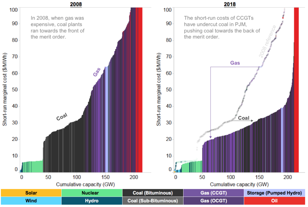
Lessons from Figure 3
- It should be clear from the figure above why oil-fired units are used sparingly. Oil is an expensive fuel so oil-burners, with high marginal costs, occupy the far-right of the merit order. They thus operate as ‘peakers’, which means they are used only during periods of extremely high demand, or during times of natural gas shortage.
- Similarly, it should be clear why nuclear plants run baseload. Their variable costs are low (even though fixed costs are high). This places nuclear towards the front of the merit order, where it is dispatched 24/7.
- The ranking of coal and gas is increasingly trickier to generalize:
- In 2008, coal plants ran baseload while gas turbines operated as ‘mid-merit’ units. In practice this meant gas plants turned off at night while coal plants stayed online.
- By 2018, coal and gas plants now ‘intermingle’ on the merit order. In PJM, the general rule of thumb is that CCGTs run baseload while OCGTs and coal plants run mid-merit.
- Emissions have fallen precisely because coal has move towards the back of the merit order. The 2008-to-2018 comparison illustrates the rationale behind the dramatic ‘fuel switch’ that has occurred over the past decade. In summary, falling gas prices reduced the short-run costs of gas plants, allowing them to undercut coal and switch positions on the x-axis of the merit order.
Short-run marginal cost (SRMC) for power plants
If we ignore transmission charges, ramping and run-time constraints, and other secondary factors, then power prices boil down to one simple equation:
Figure 4. Short-run marginal cost formula, for fossil plants
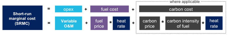
- Variable O&M (in $/MWh) is a term that captures normal wear and tear associated with operating and maintenance for power plants. It can also include the variable costs of running environmental controls like sulfur dioxide scrubbers. This term is generally small (~$5/MWh).
- Fuel price (in $/MMBtu) is the most dynamic factor in the short-run marginal cost calculation. For example, benchmark U.S. gas prices (at Henry Hub) fell from over $8/MMBtu in 2008 to under $3/MMBtbu in 2017. For comparison, benchmark coal hub prices range from $0.70/MMBtu in the Powder River Basin to $2.50/MMBtu in Appalachia. But hub prices alone do not tell the whole story: the costs of transporting coal is often as high, or higher, than the price of buying fuel at the hub. All-in, the average coal plant pays between $2 and $3/MMBtu for its fuel (hub price + transport costs).
- Heat rate (in MMBtu/MWh) is an inverse-measure of plant efficiency, specifying how much fuel is needed per unit of electricity output. Heat rates for combined-cycle gas turbines hover around 7MMBtu/MWh; coal plants cluster around 10MMBtu/MWh.
- Carbon prices (in $/tCO2e) apply in ten U.S. states spanning two separate cap-and-trade programs. In these states, short-run marginal costs of plants are boosted by the costs of allowances.
- Carbon intensity of fuel (in tCO2/MMBtu) is a function of combustion chemistry. Natural gas emits ~0.05tCO2/MMBtu while coal emits ~0.10tCO2/MMBtu. When paired with the fact that coal units are typically less efficient than CCGTs, we see that coal plants emit more than twice as much CO2 as CCGTs. Because of this, wherever carbon prices apply, they hit coal plants harder than gas plants.
Coal-to-gas pricing dynamics
The figure below compares the relative economics of power, gas and coal over time. Specifically, it compares short-run marginal costs for a typical coal unit and combined-cycle gas turbines, using the formula from the merit order analysis above.
Figure 5: Short-run costs of coal and gas versus power prices – monthly averages ($/MWh). (Source: BloombergNEF’s Power and Fuel Pricing Dashboard, Bloomberg Terminal)
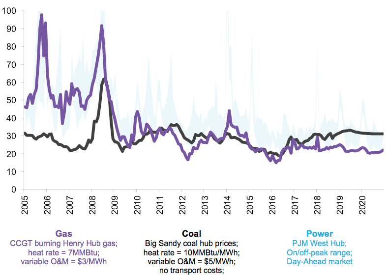
- Power prices follow gas and coal prices. Note how the blue shaded area in Figure 6 follows the purple and black lines. This is because power prices are a function of the short-run marginal cost of the marginal generator – a combination of gas- and coal-fired units.
- Coal-to-gas competition is amplified. Prior to 2009, coal units had definitively lower short-run costs than gas. Since then, prices have remained much closer to parity. This has allowed some gas units to undercut some coal units, each time reducing coal burn and emissions.
- Dark spreads are in decline. ‘Dark spreads’ refer to operating margins for coal plants. For example, prior to 2009, when power prices hovered around $60/MWh and coal costs were $30/MWh, coal plants would net $30/MWh. Since then, falling power prices and dwindling dispatch opportunities have eroded gross margins for coal plants. This is why many face retirement: many coal plants now fail to earn enough money to cover their fixed costs of operation.